


Table of Contents
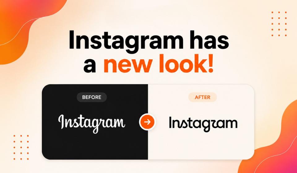
Instagram has introduced a refreshed Instagram new logo, although the change is more specifically an update to the platform’s wordmark rather than its familiar camera app icon.
Instagram head Adam Mosseri unveiled the redesigned wordmark on August 13, 2026, describing it as sharper and more modern while still referencing the platform’s original identity. The update marks the first major refresh of Instagram’s wordmark in about a decade.
The redesign is part of a wider update to Instagram’s brand identity, which includes changes to typography, icons, formats and the way the company’s visual identity is presented.
The Instagram App Icon Has Not Changed
One of the most important details about the Instagram new logo is that the familiar gradient camera icon has not been replaced.
The change primarily affects the written “Instagram” wordmark that appears in places such as the app interface, marketing materials and other brand communications. The recognizable pink-and-orange camera icon remains unchanged.
This distinction is important because describing the update simply as a completely new Instagram logo could give the impression that the app icon itself has been redesigned.
Instead, Instagram is refreshing one of the most recognizable written elements of its brand.
A More Modern Wordmark
The new wordmark retains a connection to Instagram’s familiar script-inspired identity but uses a more compact and bolder treatment.
The updated lettering combines elements of cursive and print styles, with noticeable changes to letters including the “s,” “r” and “g.” Instagram says the design aims to feel sharper and more contemporary while preserving the simplicity and craftsmanship associated with the brand.
Instagram’s design team reportedly explored hundreds of possible directions before settling on the updated approach, ultimately retaining the handwritten character that has long been associated with the platform.
Instagram Expands Its Typography System
The wordmark is only one component of the broader branding update.
Instagram is also updating Instagram Sans and introducing two additional typeface families:
- Instagram Pen, a handwritten-style typeface
- Instagram Mono, a monospaced typeface
Together, these fonts give Instagram a broader visual system for different types of communication and creative expression.
The company is also changing how its signature gradient is used, moving toward a more flexible and restrained application across the wider brand identity.
Users Have Mixed Reactions
The Instagram new logo has generated significant discussion online.
Some users have welcomed the cleaner and more modern appearance, while others have criticized the new lettering and expressed nostalgia for the previous wordmark.
One of the most common criticisms concerns the appearance of the letter “r.” Some users have joked that the redesigned wordmark reads as “Instagzam” rather than Instagram. Others have questioned the readability of the new typography.
The reaction illustrates how difficult it can be for established brands to change familiar visual elements. A design that appears subtle to its creators can look dramatically different to people who have seen the previous version for years.
Why Instagram Is Updating Its Branding
According to Mosseri, the previous wordmark had been in use for around a decade and had begun to feel dated. The redesign is intended to make the brand feel more current without abandoning its established visual character.
The broader identity update also reflects how Instagram has evolved since its previous major branding refresh.
Rather than replacing its visual identity completely, the company is retaining recognizable elements while adjusting typography and other design components.
Is a Major Instagram Product Update Coming?
The branding refresh has prompted speculation about whether Instagram could also be preparing a significant product update.
However, there is currently no confirmed announcement linking the new wordmark to a major upcoming feature or app redesign.
The confirmed changes concern Instagram’s visual identity, typography and brand system. Any suggestion that a major product launch is coming should therefore be treated as speculation rather than established information.
The fact that Instagram has changed its wordmark does not itself indicate that a major functional update is imminent.
A Gradual Rollout
The updated brand identity is expected to roll out progressively rather than appearing everywhere simultaneously.
The new wordmark and broader visual system are being introduced across Instagram’s app, website and other brand touchpoints as the company implements the updated identity.
This means users may see the old and new branding at different times during the transition.
Frequently Asked Questions
What changed with the Instagram new logo?
Instagram has redesigned its wordmark, the written “Instagram” logo used across its interface and brand materials.
Has Instagram changed its app icon?
No. The familiar gradient camera icon remains unchanged.
When was the wordmark last updated?
The previous wordmark had been in use for roughly a decade, dating back to Instagram’s 2016-era identity.
What new fonts has Instagram introduced?
The updated brand system includes a revised Instagram Sans alongside Instagram Pen and Instagram Mono.
Why are people criticizing the new logo?
Some users find the redesigned lettering harder to read, particularly because of the altered “r,” while others simply prefer the familiar previous design.
Conclusion
The Instagram new logo is more accurately described as a new Instagram wordmark rather than a replacement for the platform’s familiar camera icon.
The update marks Instagram’s first major wordmark refresh in about a decade and introduces a more compact, contemporary style while retaining elements of the brand’s script-inspired character. The wider identity update also brings revised Instagram Sans and new Instagram Pen and Instagram Mono typefaces.
While the redesign has received mixed reactions, particularly around the readability of the new lettering, Instagram appears to be pursuing a measured evolution rather than a complete visual overhaul.
For now, the camera icon remains unchanged, and there is no confirmed major product feature associated with the branding update. The biggest change is therefore visual: Instagram is refreshing how its name and broader identity appear as the platform moves into its next phase.